Mise
A case study on reducing personal food waste completed for Maryland Institute College of Art’s MPS in UX Design Program
ROLE: UX RESEARCH, UX DESIGN, UI DESIGN | COMPLETED: DECEMBER 2021
Below is a summary of my case study, read the full case study here
My partner and I love cooking but we have a problem, we’ll buy something intending to cook it, only to find it in the back of the fridge a week later (Figure 1). I thought this tweet was relatable and I know I’m not alone. Finding a solution to this prevalent issue in American households was a problem space I wanted to investigate.
Figure 1 — Tweet by @oledominguez summarizes my experience with personal food waste.
The problem
In the U.S., food waste is a prevalent issue with environmental, social and economic implications. On average, the U.S. produces about 96 billion pounds of food waste annually¹. This makes up nearly one-third of all food produced in the United States. This waste has wide-reaching implications from filling of landfills to the diminishing natural resources that are put into food production in the first place.
This issue must be addressed in all phases of the supply chain: education, policy, and incentives at the consumer level are currently lacking. Consumer food waste has many causes such as confusion over best by and use by date labeling, improper storage practices, and over-buying. Given these causes, I began my research with the question: how can technology help educate people about food waste practices?
Scope and Constraints
To help me better understand and answer this question, I conducted preliminary research and discovery on personal food waste. I recruited and surveyed participants as a part of my capstone for Maryland Institute College of Arts’ Master of Professional Studies in UX Design program. This was a solo project spanning across 16-weeks. For the first 8 weeks, I focused on defining the problem, background research, project planning, and management. During the second half of my project, I completed user research, ideation, wireframing, prototyping, and user testing. Since the timeline was constrained, usability testing was limited to 5 participants. While iterations of the prototype were tested and legitimized by those participants, more testing is needed to fully validate the results of this project.
Research
Macro-Forces
Since this is such a complex and wide-reaching issue, the Macro Forces help illustrate the problem from multiple points of view. Below are the forces that drive the consumer food waste issue.
Demographic
The U.S. is a top food waster
According to a study completed in 2010, younger people, females, and single-person households and higher income households tend to waste more food ².
Ecological
The environment is paying the price
The environmental implications of food waste are contributing to natural resource loss and climate change. Landfills alone account for 34% of all human-related methane emissions in the U.S.³.
Political
The government agency issue
The FDA food code also inadequately educates consumers on how to read food date labels. Their scope is only limited to labeling food for 3 types, refrigerated, ready to eat food that is potentially hazardous — shellfish and food in reduced oxygen packaging. This leaves little to no guidance on other foods. Hence the murky understanding of “use by” and “best before” dates ⁴.
In 2019, the USDA and Cornell university, launched “Foodkeeper” an online database for proper food and beverage storage and use by date tips (Figure 2, ASPA. 2019. “FoodKeeper App.” ). The philosophy is, if stored correctly, the food should last this long. The database is an attempt at a standardized food dating repository.
Self Determination Theory
For any behavior change app to be successful, users need to be motivated to use it. Many apps rely heavily on extrinsic motivators like popularity and “likes” but my goal would be lasting change, motivating people intrinsically. Based on research on Self Determination Theory (Ryan and Deci), there are 3 basic psychological needs in order to move a habit towards intrinsic motivation, autonomy, competence and relatedness. A study using this theory and 208 apps ⁵, showed there were specific features that aligned with these 3 categories (Figure 2). I used this research as a foundation for my product.
Figure 2 - Self Determination Theory
The research began with acknowledgement of both assumptions and risks.
Assumptions
Shopping smarter, i.e. meal planning, helps reduce personal food waste.
Inventory tracking, i.e. keeping track of best by/use by dates, helps reduce personal food waste.
Due to time constraints, these were not researched. Further investigation should be done to validate these assumptions.
Risks
People may not be inspired to reduce their personal food waste in the first place.
People might not be motivated to stick to their food waste reduction goal.
The research on Self Determination Theory behind key features of this app hope to mitigate this risk, but since every user is different, there is no one size fits all approach to changing behavior. Thus, this risk remains. A full risk analysis will be provided later in this case study.
Problem statement
How might we provide a digital product that will educate consumers on sustainable food practices and inspire them to reduce their personal food waste.
Research methods
Due to the individualized nature of grocery shopping and preparing meals, It was determined that a Diary Study would yield the best results. Diary studies are used to understand behavior over time. This allowed me to observe the participant’s planning, shopping and eating habits over 10 days. The participants had to answer beginning, middle and ending survey questions ranging from what they purchased, to how much they threw away.
12 participants filled out the initial questionnaire, this was the largest of the surveys and I received good insight into overall preferences and habits. 7 of those participants finished the diary study.
Analysis
The most reported reason for food waste was that it was expired, 6/7 participants reported this.
The overall sentiment about wasting food was Sad (4/7) followed by Guilty (2/7).
When asked if they knew how to get sustainably sourced food, the split was about even with 4-Yes and 3-No.
When asked if they currently have a meal plan, the split was even between yes and no.
5/7 users thought meal planning would help them reduce food waste, while 2/7 said the packaging size in stores was a big reason for waste.
Overall the participants who went through the week with a meal plan reported feeling excited about cooking while users who didn’t have a meal plan reported feeling lazy, bored and mediocre about cooking during the week.
All participants said reflecting on their previous week’s meals make them want to improve for the next week.
Mindsets
From these insights, 4 mindsets of the user were created (Figure 3). These mindsets helped to inform what features a digital solution would need to help the user create and maintain habits to reduce personal food waste.
Figure 3— Mindsets based on user research
Concept & Proposed Solution
Based on both the preliminary and user research, it became clear that the need for a digital solution to help address this problem was high.
The MVP needed to accomplish 3 things:
Motivate people to change their habits
Using the SDT research outlined above, integrating features into the product to accomplish this would include: reward systems, reminders and performance sharing (among others as needed)Educating people
From the diary study, users reported food spoilage as the top reason for throwing away food. Giving them a way to be alerted to when their food is going bad, as well as a “eat by” date would help clear up any uncertainty about if the food is bad or not. The eat by date for each food item would be pulled from a database created by Mise, based on the USDA’s “Foodkeeper” database recommendation for food safety and freshness.Environment focused
Since food waste is not only a personal issue but an environmental issue, sustainable shopping practices like buying food locally, in smaller quantities and avoiding meat should be promoted and encouraged on the consumer level. Some features could be: giving users rewards for doing these things consistently, and suggesting tips on how to get started. Offering a larger sustainability goal for everything that is accomplished in the product will be key to keeping this theme at the forefront of the experience.
Based on the MVP goals, the logical solution was a digital meal planning, grocery list and digital pantry mobile application with a focus on sustainability.
Competitive Analysis
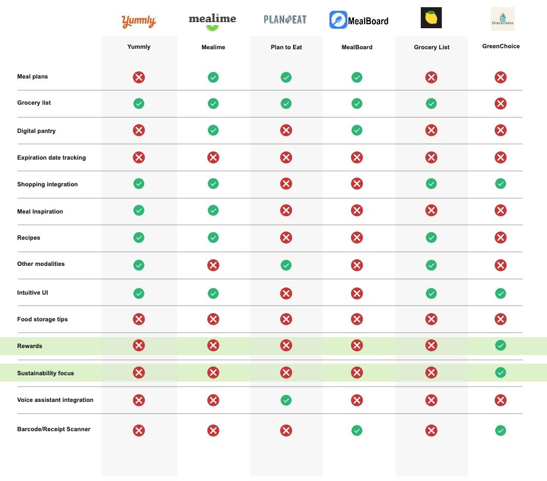
There are a few meal planning applications on the market today. 6 competitors were audited for 14 features (see Figure 4). From this analysis, it was confirmed that there is space for a product that puts sustainability at the core of the experience. Only one app provided this and it did not have the other key features such as meal planning and digital pantry. Rewards was another aspect that was not included in many of the app’s approaches.
Figure 4— Competitive analysis outlining key features
Target Audience
From the initial research, the target audience is American middle to upper class earners who have an interest in food and sustainability. Most of the participants recruited identified as women but there was not enough data to draw a conclusion on gender, therefore people, ages 18–65 are the target.
Desired Outcome
The desired result of this mobile app is to provide a digital solution to help users reduce their total food waste by meal planning, shopping sustainably and keeping track of the expiration dates in their inventory. The goal is to help encourage new habits around reducing personal food waste by offering a reward system based on good behavior and consistency.
Business Case
With the all-in-one meal plan, recipe and grocery list experience the app would provide, it would be well suited for advertising. The experience would include an opportunity for brands to pay for sponsored product suggestions within the app. Recipes for meal plans would suggest their brand of product as an ingredient that the user would be able to order online directly from the app. The app would only partner with companies who have sustainable products and practices and match the brand vision and ethos. This gives the app a curated feel that would elevate whatever brand is promoted within it.
The rewards feature within the app would also be an opportunity to partner with local grocers. The grocers could offer coupons to be earned by users in the app in exchange for store promotion.
Design
I worked through lightning demos, crazy 8’s (Figure 5) and low fidelity wireframing to work through key features:
Home screen — dashboard, insights, this week’s plan, tips
Inventory — Best by/use by date, alerts to items expiring soon, suggestions, recipes
Meal Plan — weekly, suggestions, recipe import
Grocery list — tips for sustainable food, ingredients from recipe, integration with online grocery shopping
Environmental impact — points for sustainable purchases/habits
Food storage tips — vacuum sealingCrazy 8’s on the COVID-19 hangout preferences
Figure 5-Crazy 8 Sketches
User Flows
Two user flows were created outlining the user journey. (Figure 6.1, Figure 6.2)
Figure 6.1 — Beginning of the week flow
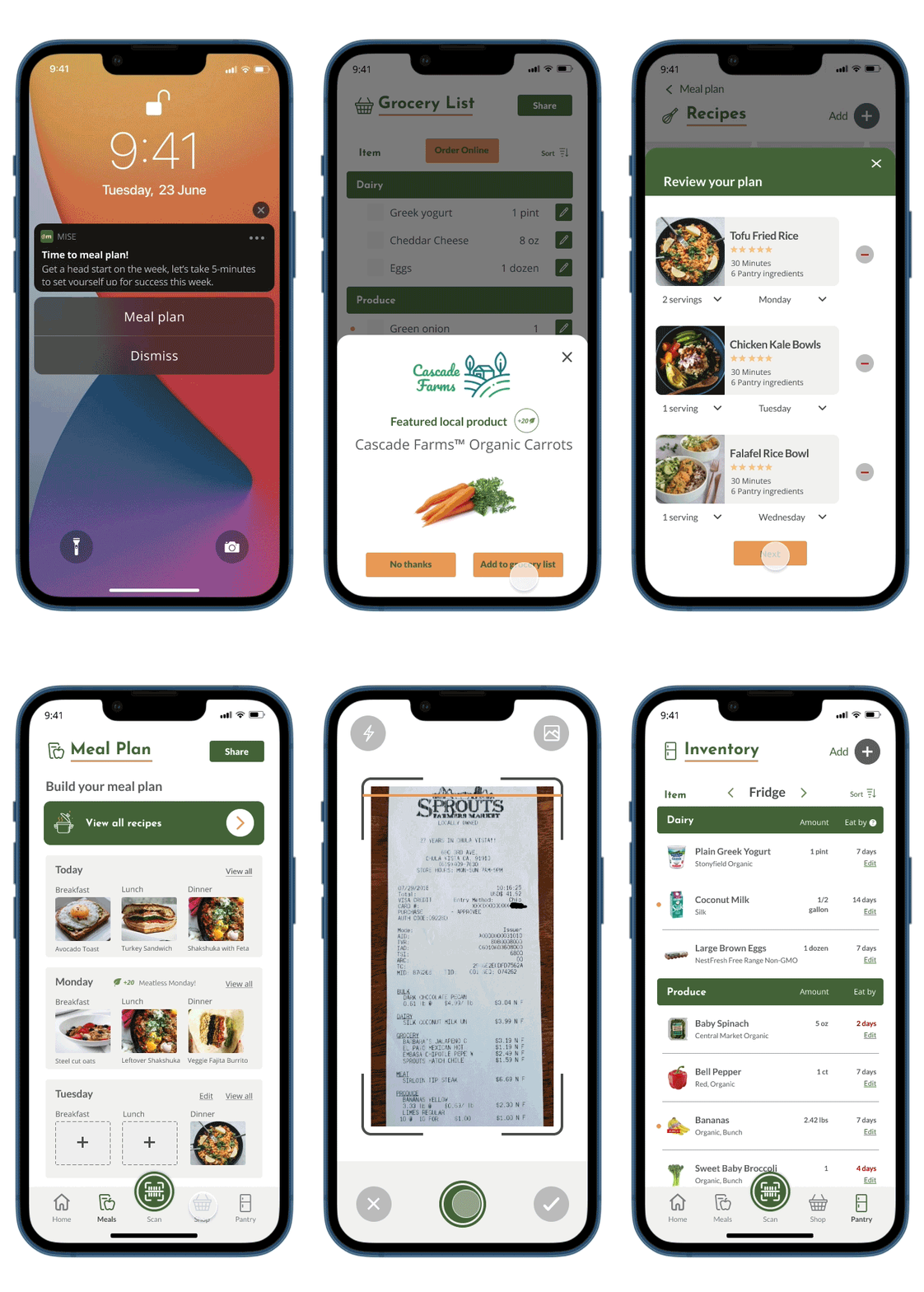
The beginning of the week flow shows the user meal planning, using recipes based on currently inventory, adding any missing ingredients to the grocery list, and adding purchases to the inventory.
Figure 6.2 — Mid-week flow
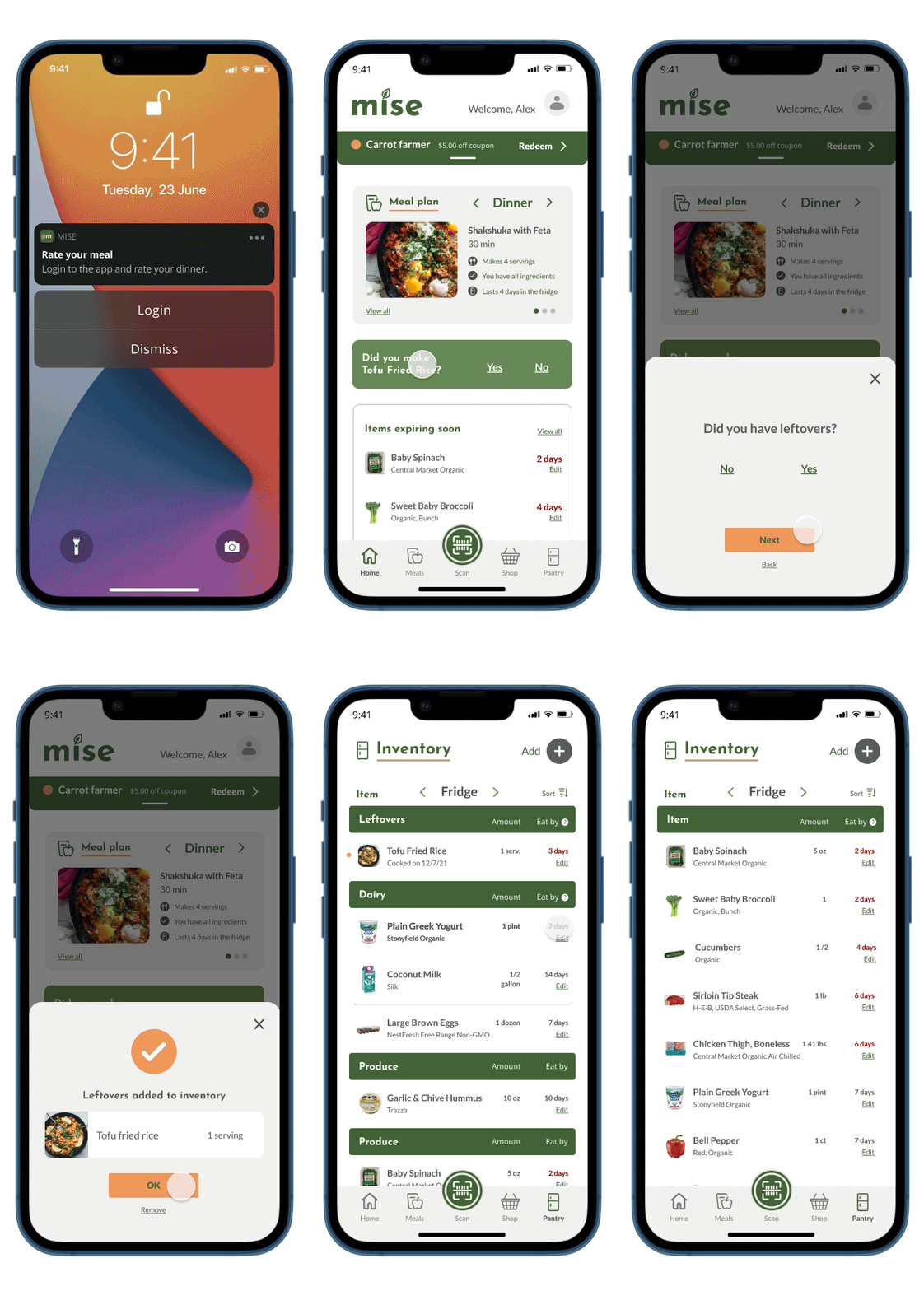
The mid-week flow shows the user rating their meal and adding any leftovers to the inventory.
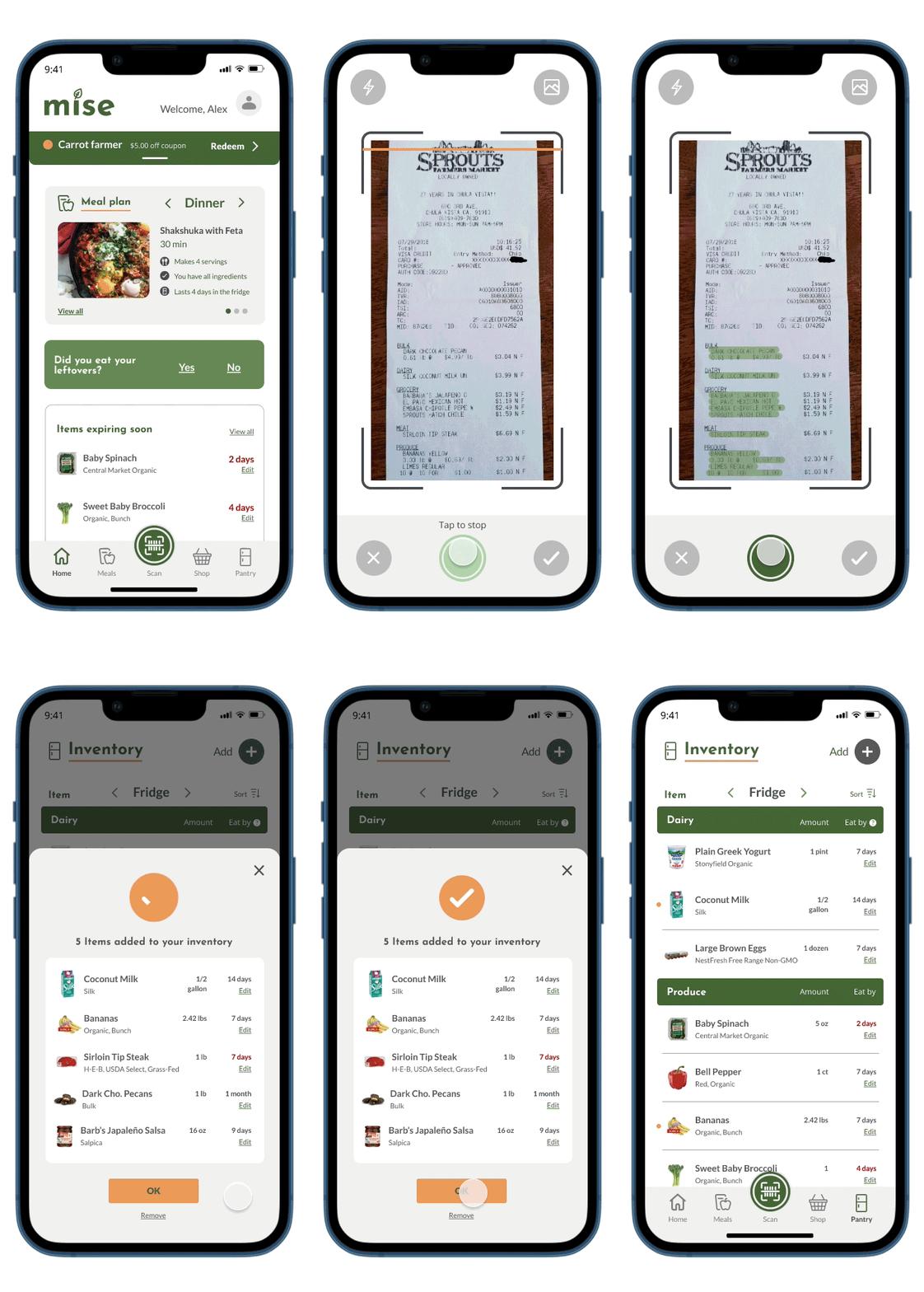
During this process, the idea for scanning the item or receipt was realized as an easy way to import purchases or check if the item was in the user’s inventory. The overall theme of dynamic meal planning was introduced as well, meal plans would be suggested based on the food the user already had in case the user didn’t want to go grocery shopping.
Mid-Fidelity Wireframes
The first user flow, Start of the week, was wireframed. Due to time constraints, the other two were not. (Figure 7). At this stage, the wireframes were tested and reviewed by two participants who provided feedback on features and overall flow. Feedback included:
Might be a challenge to get users to input their groceries and expirations dates
What would happen if you don’t have something needed for a recipe?
What do the achievements mean?
Would scanning as you buy make inventory easier?
All questions to be addressed in the next round of wireframes.
Figure 7-Mid-fidelity wireframes
Prototype
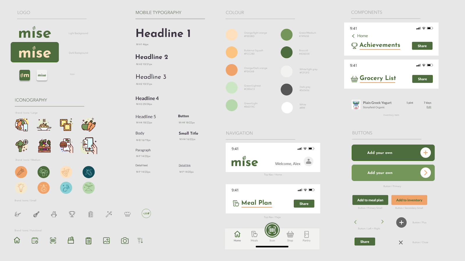
The design logo and design system was created and implemented in the high-fidelity prototype. (Figure 8) The brand name Mise was chosen as a play on the french culinary phrase “Mise en place” meaning “putting in place” or “gather”. It’s a term used in professional kitchens to describe preparing all of the ingredients before making the meal. The fonts and icons have elements of lightness and surprise.
Font — The primary brand font, Josefin Sans was selected because of it’s unique slants and points resembles cuts from a knife, while the character spacing allows for readability as a title font. The secondary font being Lato for it’s readability at smaller sizes.
Icons — The iconography was selected to be joyful, approachable and fun. The largest icons used for educational purposes, making food sustainability seem inviting and simple. The medium sized icons used for achievements are meant to feel sleek and like something the user would be proud to collect.
Figure 8 — Design system
Testing
The High-fidelity prototype was tested by four participants. Testing consisted of 3 tasks and 4 follow up questions. All participants were able to finish the tasks but there were points of friction. The feedback is outlined below.
Task 1: Build a meal plan using the recipes, include the tofu fried rice recipe in your meal plan.
Results: Most participants struggled with this task because they couldn’t figure out where to build a meal plan from the home screen. Once in the meal plan screen, they could achieve this task.
Feedback: Most participants liked the recipe feature, one chose the “Choose for me” option instead of building the meal plan manually.
Task 2: Add items to your grocery list, complete your shopping and load your purchases into your inventory.
Results: All participants were unsure that the items from the recipe had been added to their grocery list, since there was no confirmation.
Feedback: There was big confusion over which screen was for the grocery list vs. inventory.
Task 3: View your achievements.
Results: All participants navigated to the achievements page from the home page.
Feedback: Participants reported feeling like the achievements weren’t a primary goal of the app. Some participants wanted to be able to share achievements on social media. One participant wanted to exchange points for store coupons and was curious about her larger ecological footprint from reducing food waste.
Overall results:
2/4 participants wanted to see a sort function in their pantry so the items going bad the soonest was at the top.
Overall, there was confusion over the main navigation icons and what they meant and when they were active.
Overall, all participants struggled with where to go on the homescreen.
Participants wanted a more obvious access to meal plan list
One participant would prefer viewing their pantry grouped as meals, similar to meal kits.
Participants reported wanting to see photos of the actual products in their inventory, including brand.
Overall, the users had a difficult time locating the scan feature and knowing when to use it.
Figure 9.1 - Achievements
Figure 9.2 - Home screen revamp
Figure 9.3 - Confirmation overlay
Updates made (Figure 9.1, Figure 9.2, Figure 9.3):
Home screen simplification and revamp — based on feedback from users, the meal plan section was prioritized to the top of the page.
Orange ellipses were added next to items recently added to the inventory, to give users a confirmation.
The main navigation was revamped, icons were changed, labels were added below icons and a color activation interaction was added. The scan feature was prioritized to show users it was a separate action from the rest of the navigation.
Corresponding icons were added to each page title to help keep the user grounded.
iOS UI components were added to enhance legitimacy of the prototype.
Overall progress was added to the achievement screen.
Images and brand name were added to the inventory list as well as a sort function.
Usability Testing — Round 2
This prototype was reviewed by 5 users. In the interest of time, this final usability test was done asynchronously via a google form and prototype link. There was one follow-up, one on one interview conducted. The goal of this round of testing was to get feedback on the icon choices, to see if the user could locate the achievement screen, and if they found the sustainability tips.
Results
5/5 found the achievements screen — This confirmed that the new prioritization on the home screen worked.
Only 2/5 found the sustainability tips
The icons were well received — confirming the labeling of the icons worked to clear this up for users.
Overall, users used words like “Meal planning, sustainability, less waste and tracking food” to describe the purpose of the app.
User frustrations
Users couldn’t find the recipes without adding to a meal plan
Users couldn’t tell which items from the recipe were added to the grocery list — something addressed in previous revision but would need to be more obvious.
User questions:
What happens if I accidentally add ingredients to the grocery list, how do I undo it?
How do I edit the receipt if I scanned it wrong?
What happens when something I want is out of stock?
Would I be able to share my grocery list with my husband?
Final Prototype
The feedback from the last round of user testing was taken into consideration when preparing the final prototype.
Figure 9.1 - Beginning of the week flow
Figure 9.2 - Mid-week flow
Results
From the user feedback, I was able to update the prototype to include my proposed solutions. Updates made shown in Figure 9.1, Figure 9.2.
Mid-week flow was prototyped, showing how rate a cooked meal and add leftovers to the inventory.
App preview screen added, centering the user on the issue of food waste and giving an overview of the goal of Mise.
Year to date achievement trends added — this helps the user stay motivated towards their goals.
The achievement progress drawer loads closed instead of open — making the homescreen easier to navigate on launch.
Added a “View all recipes” button at the top of the Meal Plan page — making the access to recipes front and center.
Creating a confirmation overlay when items are added to the grocery list — letting the user know specifically what was added and giving them an option to cancel that action.
Creating a similar confirmation overlay for adding items to the inventory where users have the opportunity to cancel and start over.
Share with a person function added throughout the app.
How Mise will turn a goal into a habit
Based on the BPNs (Basic Psychological Needs) of the user, research discussed in this case study shows, features in the Mise app will help to move the user along the motivation spectrum towards intrinsic motivation. Reviewing the original list created by Gabriela Villalobos-Zúñiga and Mauro Cherubini, the highlighted features are present in the final prototype:
Autonomy
Reminders — Push notifications sent to the user to remind them when food is going bad or to complete their weekly meal plan.
Competence
Rewards — Users are rewarded when they purchase sustainably, meal plan consistently, or consistently eat food before the expiration date.
Relatedness
Performance sharing — Users are able to share their accomplishments via email, text or social media.
Outcome
Challenges
Working on tight deadlines always poses a challenge. The biggest challenge of this project was settling on an MVP. The problem statement was reiterated throughout to ensure that every feature created was directly applied. Though some of the user flows were not fully realized, the final prototype is a strong representation of the basic feature ideas and shows the potential for what Mise can be.
Next Steps
Additional feature ideas that were not realized include:
Proper food storage tips — fridge diagram
This was the original direction of the project but after conducting the diary study, not enough users noted this as their primary source of food waste problems. This feature would be a good candidate for phase two work as there is not enough education out there around how to properly store food, where to store it and how to package it.
When something expires — nudge to compost
Composting fell outside the MVP because the app’s core focus was reducing food waste by purchasing and eating smarter. That said, composting is the other half of this solution and needs to be explored for this app to be fully sustainable.
Social element where people can share tips, and recipes
The social share function was the extent of the social aspect to Mise but there is plenty of room for improvement. Adding a social community to the app would not only fall under the BPN of relatedness, but would help the experience stay fresh. Users could share their own tips for sustainability beyond what the app suggests, as well as recipes. Mise has a strong opportunity to host a wealth of UGC.
Integration with smart fridges like Samsung Family Hub
This was explored briefly in the ideation phase but with the increasing prevalence of smart fridges, integrations with emerging technology will be critical to Mise’s success. One of the features of the fridge is a camera on the inside of the door to show the user what they have. This functionality would be a perfect integration for the Mise app.
Conclusion
Environmental issues like climate change are often so large that people feel too overwhelmed to act. A popular sentiment is that a problem is so large, how can my small action make a difference? Mise was created to give users small, actionable steps relevant to their daily lives to make them feel like they are making a positive difference in reducing food waste. This is not an easy task, and further testing with a larger audience is needed to understand if the features outlined in this case study actually accomplish this. As for my personal food waste, I think I’ll be keeping a closer eye on that spring mix.
Notes
¹ Evans, Alexandra I., and Robin M. Nagele. “A LOT TO DIGEST: ADVANCING FOOD WASTE POLICY IN THE UNITED STATES.” Natural Resources Journal 58, no. 1 (2018): 177–214. http://www.jstor.org/stable/26394778.
² Jean C. Buzby and Jeffrey Hyman, “Total and per Capita Value of Food Loss in the United States,” Food Policy 37, no. 5 (2012): pp. 561–570, https://doi.org/10.1016/j.foodpol.2012.06.002.
³ Evans, Alexandra I., and Robin M. Nagele, A Lot to Digest, 181
⁴ Evans, Alexandra I., and Robin M. Nagele, A Lot to Digest, 179–183
⁵ Gabriela Villalobos-Zúñiga, Mauro Cherubini, “Apps That Motivate: a Taxonomy of App Features Based on Self-Determination Theory”. International Journal of Human-Computer Studies, Volume 140, 2020, 102449, ISSN 1071–5819,
Further reading
Assistant Secretary for Public Affairs (ASPA. 2019. “FoodKeeper App.” FoodSafety.gov. FoodSafety.gov. April 26, 2019. https://www.foodsafety.gov/keep-food-safe/foodkeeper-app.
“Food Product Dating | Food Safety and Inspection Service.” n.d. Www.fsis.usda.gov. https://www.fsis.usda.gov/food-safety/safe-food-handling-and-preparation/food-safety-basics/food-product-dating.
MOURAD, MARIE. 2015. “THINKING OUTSIDE the BIN: Is There a Better Way to Fight ‘Food Waste?’” Berkeley Journal of Sociology 59: 26–34. https://www.jstor.org/stable/44713541.
Ryan, Richard M, and Edward L. Deci, eds. 2017. Self-Determination Theory: Basic Psychological Needs in Motivation, Development, and Wellness. Guilford Press. https://doi.org/10.1521/978.14625/28806.
“Why People Aren’t Motivated to Address Climate Change.” Harvard Business Review, 9 Sept. 2021, https://hbr.org/2018/10/why-people-arent-motivated-to-address-climate-change.
