PowerBI Dashboard Templates & Style Guide
A case study on creating PowerBI templates and a company branded style guide
ROLE: UX/UI DESIGN, PROJECT MANAGER | COMPLETED: MAY 2023
This work was completed while working as a consultant for CGI. This work is confidential and has been anonymized.
Project Overview
A leading national distributor sought to improve data visualization within their Power BI dashboards. They required a UX team to create a branded style guide outlining data visualization best practices and develop reusable dashboard templates across departments and regions. Additionally, the project aimed to create a WCAG 2.1 AA compliant Power BI theme.
Results
Visually appealing and accessible Power BI templates delivered.
Branded style guide ensured consistency and provided clear data visualization guidance.
Client reported immediate template and guideline utilization, leading to significantly improved dashboard.
Challenges and Scope
Data and user access limitations presented significant hurdles. Interviews and direct data access were unavailable, requiring creative solutions and reliance on publicly available information.
My role
As a UX designer and project manager, I led a two-designer team to create visually appealing and accessible Power BI templates. I devised innovative approaches to overcome data and user access restrictions, leveraging the power of AI-assisted research.
Process
Artifact from brainstorm session created in Figjam
Research and Analysis
Conducted a comprehensive literature review on data visualization best practices and industry trends, leveraging AI-powered research tools to streamline information gathering and analysis.
Analysed publicly available industry reports, benchmark data, and relevant news articles identified by AI tools.
Utilized online forums, communities, and social media platforms to gather user insights and pain points, with AI sentiment analysis assisting in identifying key themes and trends.
User journey presented to the client to validate our research
User Journey Mapping
Created user personas based on industry research, publicly available data, and AI-generated insights into employee roles and responsibilities.
Mapped out user journeys to identify touchpoints and pain points within the existing dashboards, leveraging AI-based journey mapping tools for visualization.
Presented the user journey map to the client for validation and feedback.
Ideation & Design
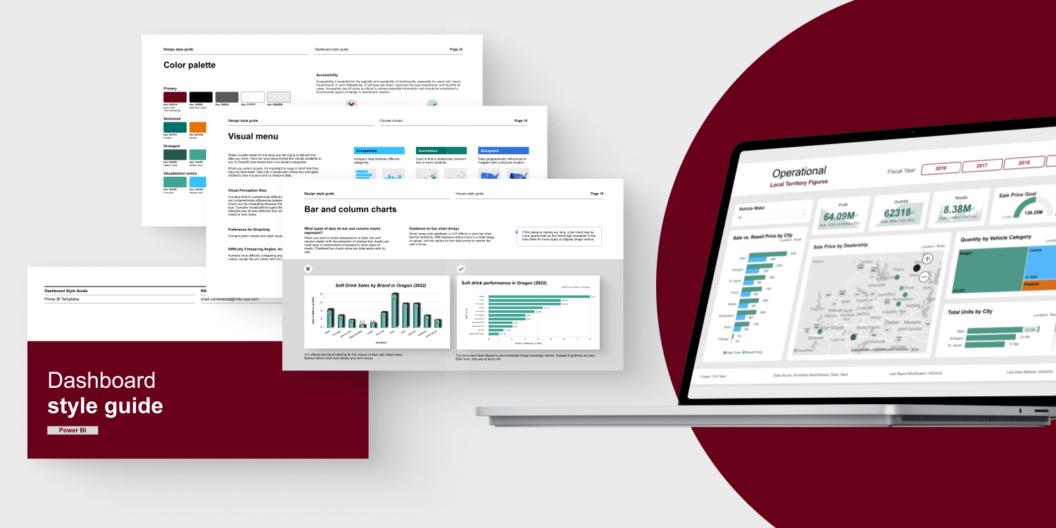
Developed a style guide encompassing color palettes, typography, and accessibility-conscious data visualization best practices.
Created wireframes and mockups for Power BI templates adhering to the style guide and the client's branding.
Conducted internal usability testing with mockups to refine the design.
Low-fi mockups of the style guide pages, created in Figma.
Pages from the Style guide that describes best practices, created in Figma.
Implementation
Collaborated with a front-end developer to translate our Figma designs into functional Power BI templates.
Ensured replicability and provided instructions for template usage and data visualization best practices.
Developed a WCAG 2.1 AA compliant Power BI theme.
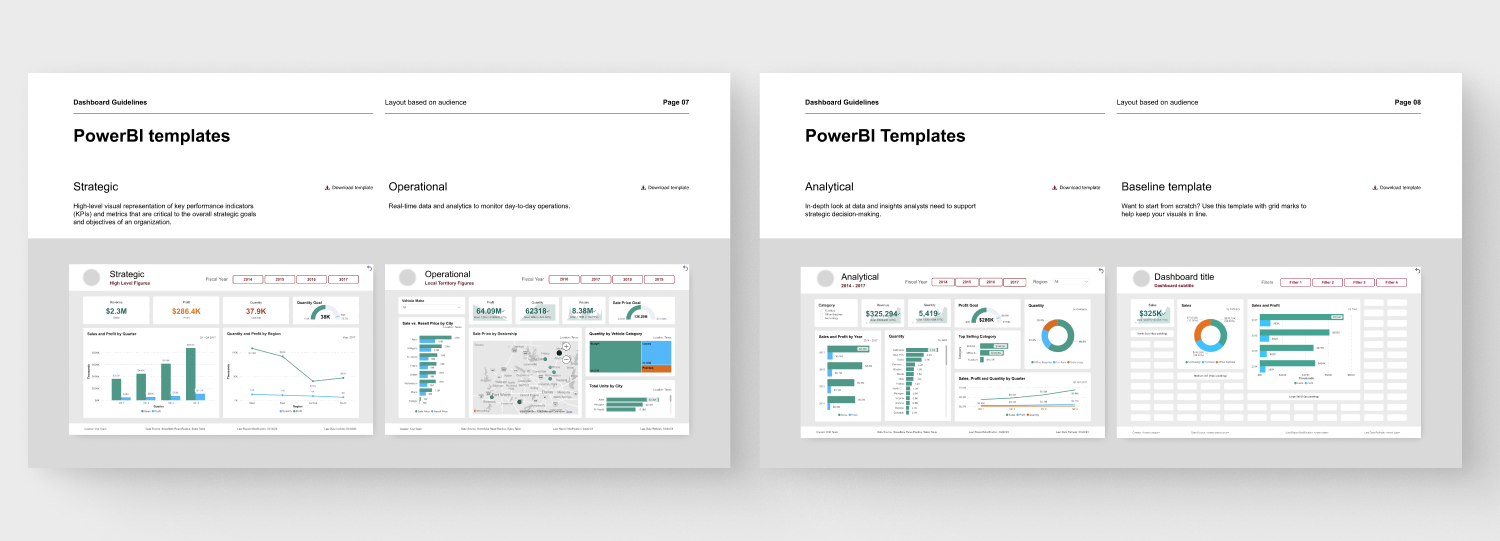
Pages from the style guide that featured the PowerBI templates.
Delivery & Feedback
Presented the final deliverables to the client, including templates, style guide, and theme.
Gathered feedback from client stakeholders and incorporated it into the final version.
Provided ongoing support and training on using the templates and style guide.
Next steps
Through innovative solutions, leveraging AI where possible, and collaboration, we delivered accessible and visually compelling Power BI templates. The accompanying style guide promotes data visualization consistency and best practices, empowering the client to make informed business decisions and better serve their customers.
Upon the delivery of the project, we pitched possible next steps to the client. This was well-received and started as a discussion point for future work.
Building a custom icon library, based on unique KPI's that, we could develop a custom icon library that could be used with these templates.
The visual guidance we provided was based on the out of the box powerBI visuals, we could work with the client to create custom visuals for their unique scenarios and KPI’s.
Now that we have created a custom theme file, we can help with the process of applying the theme file to existing dashboards and making sure that the visuals are translating well.
Gather feedback from user and make any necessary iterations to style guide and templates.


