directorsmortgage.com
Website redesign for Directors Mortgage
ROLE: UX DESIGN, UI DESIGN | COMPLETED: JUNE 2017
This project was completed in June 2017. Looking back, I now see how we could have improved our process. I am going to walk through what we did but also, what approach I would take now.
THE PROBLEM
Stakeholders came to the marketing department with a question - how can we turn our website into a digital loan officer? They wanted a portal where clients could go and learn about mortgages, get a sense of what makes Directors Mortgage different and apply for a loan.
From the back-end, the original site was built on Squarespace by my marketing manager in 2014. Then, the company had about 30 Loan Officers. Fast-forward to 2017, the company had brought on another 40 Loan Officers (LO). The way the Squarespace template was set up, each LO had 4 pages. This bogged down the site, making updates to the pages very slow on Squarespace.
RESEARCH
We conducted competitor analysis, looking at the both local and national online mortgage experiences. Our top competitor was Guild Mortgage, others were Movement Mortgage, Rocket Mortgage and Prime Lending. They all had impressive online applications that were easy, quick and inviting. We came up with a list of must-haves and presented that to our stakeholders to make sure we were on the same page.
This is where I would have liked to interview mortgage clients to get their take on what they thought about the online mortgage application experience.
Analysis
From looking at competitors we identified some shortfalls on our site.
Internal Pain Points
Backend very slow to edit
Analytics lacking
No leads being generates from the site
Shortfalls
No way to learn about mortgages
Website loading time
No blog
No resources for new homebuyers
Design
I worked with my Marketing Manager to create a new site map that included our information architecture for the site.
We wanted to make sure there was an apply now CTA on the front page as well as the footer of each page.
We identified a couple key challenges regarding the application:
Challenge 1:
The application needed to be connected to a loan officer, so we had to build in a way to match the client up with the loan officer they were working with if they clicked on the apply now link.
I wireframed this interaction and presented it to stakeholders.
Challenge 2:
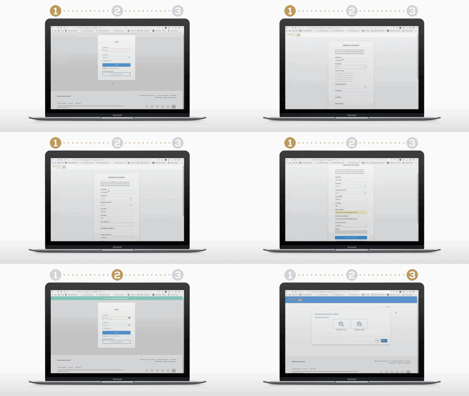
The application itself was hosted by our internal application process software, Encompass. The landing page was a login page. For new clients, we needed a way to direct them to create a new account since we were worried not everyone would find that first step intuitive.
I came up with the idea of this landing page that included a .gif with clear instructions before proceeding.
Prototype
Since our old site was bogged down in squarespace, we needed to start fresh with a new site. None of us were developers and we couldn’t convince the stakeholders to hire any, so we started building out version two in squarespace.
Looking back I wish we had gone with wordpress, it is much more customizable and less restricted.
My role for the build out was page structure and graphics. My manager filled in the copy and edited the styles. Towards the end of the project, we had hired a social media manager who was able to help us with the Loan Officer page build-out as well. Each page needed it’s own application link and contact button, it was tedious work. The process took us a little over a year since we had our daily marketing responsibilities as well and the approval process from stakeholders was very slow.
TESTING
Like I mentioned above, this is definitely a step I would have added to the process. While we did put this in front of staff for feedback, we failed to interview users. I think this would have been useful, especially with the online application process.
Our testing consisted of recruited Loan Officers and employees running through the site to make sure everything was linked up and working properly.
OUTCOMES
The website launched in 2017, our analytics improved and we gained leads. It was considered a success by our stakeholders and a huge step in the right direction.
WHAT I LEARNED
During the Project:
This was my first website design so it opened my eyes to the planning and organization that goes into a site of this size. My favorite part was figuring out the flow a client would go through to submit an application.
Looking back:
This was my first taste of UX and I absolutely loved it. There were a lot of steps that we missed and the site could have been a lot better, but at the time it was a big improvement. The level of creative problem-solving I had to bring to the table made me excited to come to work. I was figuring out CSS and HTML to modify the Squarespace template, problem-solving form locations, and learning a lot about image optimization.
Sometimes, I think it takes biting off more than you can chew to really grow and learn something completely new.
We went through another redesign in 2019 and it’s obvious to me now, had we done proper user research and testing, we could have prevented another costly re-design.


