Knowledge Coop Homepage
Internal company intranet restructure and migration for Directors Mortgage
Role: UX Design, UI Design | Homepage UX Design completed: January 2021
The problem
Directors Mortgage needed a centralized place where employees could find everything from news and announcements to training and guidelines. The old solution had employees going to multiple sites to retrieve information and complete tasks. The directive from leadership was to migrate everything over to the “Knowledge Coop”, the old training platform we were using.
How might we create a central hub for all important company information, training, and tools?
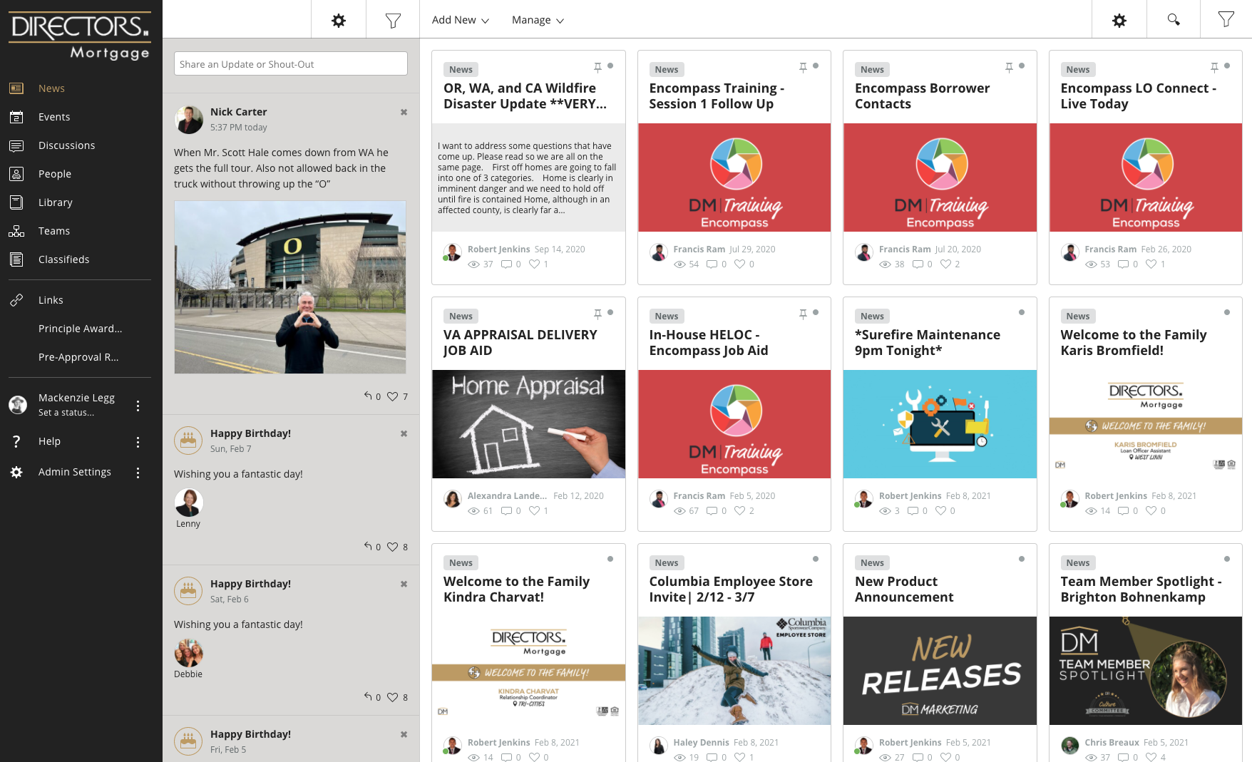
Screenshot of the original Knowledge Coop site. This was used for training only.
Screenshot of the old company intranet site on jostle.
Research
My coworker created a survey and sent it out to 25 people in our organization. We made sure to collect feedback about the current site, including the most used features and what they would want to see on the new site. We received feedback from our two user types:
Sales Staff - Loan Officers
Support Staff - Everyone else
I compiled the feedback into an airtable for analysis.
My co-worker conducted the user research and I gathered the findings into airtable
Analysis
Pain Points around current setup on Jostle and Knowledge coop
Sales Staff - The most common pain point was not being able to find guidelines for loans and it wasn’t clear company updates were the newest.
Support Staff - The most common pain point was not having all of the forms and library items in the same place, making it hard to find things.
Most used features on Jostle
Team Directory - Using jostle to look up a team member’s information
Guidelines Library - Looking up guidelines for specific loan programs
Posting Company Updates/Announcements - The majority were department heads and support staff
Reading Company Updates/Announcements - The majority were sales staff
Design
After taking a look at the feedback, I worked with our marketing manager to determine the most important categories to list on the homepage.
I did an audit of the current Jostle site and from our research, we identified the most important categories.
We wanted to make sure people could access the library of documents easily from the homepage.
We also wanted the Company Announcements to display at the top of the page since this was a big reason people were logging in to jostle.
The team directory was already a feature displayed on the homepage of the knowledge coop, so that part was already done.
Jostle site audit I did to determine important categories
Knowledge Coop Wireframe created in Adobe XD
Prototype
My marketing manager brought the wireframe to key stakeholders and received feedback on categories and quick links. The overall hierarchy was approved, the specific categories of information required a bit of tweaking. From there I took the wireframe into a higher fidelity prototype. Since the Knowledge Coop platform was drag and drop design, I knew it would have limitations. I tried to keep my tiles simple and easy to read.
High fidelity prototype for the homepage designed in Adobe XD
Testing
The prototype was presented again for stakeholders to review and it came back with a few more category changes and one large addition. Our CEO requested a live “scoreboard” section where the current company revenue could be displayed. I knew this scoreboard would need to be able to be updated by someone without design or coding experience. I did some googling and came across Microsoft Sway, a quick way for users to combine images and text to create presentations. Since our company uses the Microsoft suite, I knew this might work for us.
I figured out I could create a slideshow in Sway that automatically changes slides and embed that into the top right content bar in Knowledge Coop. It took some tweaking but it worked great!
Outcomes
I built out the final design in Knowledge Coop. Even though I had to tweak the images to fit the product’s drag and drop constraints, the final product had a similar feel to the original prototype. Luckily, the platform allowed for custom CSS so I could get the fonts I wanted. The Sway slideshow brought an animation element that really woke up the homepage experience. Our stakeholders were very impressed and happy with the design.
Next Steps - Since this was all about the homepage design, the next steps will be building out each library item with the content that our users are looking for.
Final homepage design in Knowledge Coop
What I learned
I was on a short time constraint to get this in front of stakeholders. If I had more time, I would have done additional user research and testing with the Sales and Support staff. The testing came down to a couple of review sessions with stakeholders, who fell under the Sales Staff category but I think they have different needs than the Support staff. It can be difficult to make the case for usability testing and research when the stakeholder likes what they see and wants to go with it.


